Hey everyone, I'm Alicia and I blog over at
A Sweet Fragrance. My family and I are American-born but live as expats over in SE Asia. I blog about our life overseas, recipes I attempt to make while substituting lots of ingredients, projects I do around the house, "tot school" lessons I teach to my toddler, and lessons I learn through parenting and walking with the Lord. I believe it's always a good time for coffee and I blame and also thank my husband for turning me into the coffee snob I am today.
If there is one thing that has motivated me to improve my photography skills, it's been the growing popularity of various photo oriented social media platforms. Photos are the first thing a reader sees before considering whether or not to continue reading the text, which is a humbling fact when you consider how much work you put into your writing.
It's true though. If a photo or graphic design catches my eye, I'm more likely to click on the link. Naturally, I keep that in mind when selecting photos for my own blog. The photos I choose are the first impressions I'm giving to potential readers. Therefore, I'm constantly learning about all the settings of my DSLR camera and reading tutorials so that I can improve the quality of the photos that I will ultimately share on my blog. However, it's not always realistic or convenient for me to carry that camera around everywhere.
For example, the other day I took my son to an indoor play gym that requires a parent to accompany children under a certain age. I didn't want to miss out on a cute photo op as my son climbed, slid, and swung in the jungle gym. But could you imagine me, a full-grown adult, climbing through that jungle gym with an expensive camera dangling from my shoulder while also trying to ensure the safety of my child? It was inevitable that my iPhone was going to have to suffice as my camera.
Don't get me wrong, the camera on the iPhone is impressive and serves as a great and convenient backup when you need to travel light (or in my case, climb through a jungle gym), but the quality is easy to distinguish when compared to photos from my DSLR camera. Fortunately, even if your photos don't turn out to be be the quality you had hoped, there are other ways to make a photo grab the attention of its viewers, no matter what type of camera you use. By adding text, filters, and unique crops to your photos, you can transform a photo into a visually attractive graphic that brings more viewers your way.
For some of you, the thought of graphic design might give you an immediate headache. Let me quickly put your mind at ease and inform you that I'm a former elementary school teacher turned stay at home mom. My design expertise centers mainly around glue sticks, pipe cleaners, construction paper, and wiggly eyes. Now that you know my credentials, I want to share one of my new favorite apps that will unleash the inner designer in all of you.
The name:
Studio Design. It's game: helping you make top-notch visual creations. With over 500 free shapes, crops, and fonts, you will find yourself with endless creative options. It's also very easy to export your design to Facebook, Instagram, Twitter, and other social media platforms. One additional unique feature with this app is that you can "remix" any design from any designer! The home feed is set up similar to that of Instagram. If you come across a design you like as you're scrolling through the designs of people you're following, you can just click the "remix" button and it will open up their design as an editable version. That way, you can reuse certain elements and personalize it without having to start from scratch. Pretty awesome!
This app is very user friendly but I thought it would be nice to offer a quick tutorial so that you can see some of the basics and get a general tour of where all the features are located. First, I'll show you how to create a design from scratch and then I'll show you how to "remix" a design.
Once you've downloaded the app, you'll want to click on the green plus (+) button to start a new design project.
For your base photo, if you choose to have one, you can snap a photo right at that moment or select a photo from an album on your phone. For this tutorial, I selected a photo from my phone which I took while climbing around in the aforementioned jungle gym.
At this point, you can resize your photo and edit it. I love the graph that appears every time you want to position your photo, text, and any other overlays you add. It helps to get everything lined up and centered evenly.
Next, you'll want to start adding overlays. To do this, click the button in the far left hand corner of your screen.
A sidebar will appear and give you the option to "Add Overlay". You might also notice the thumbnail of your base photo. If at any moment you decide you need to edit your base photo, simply tap the thumbnail. If you decide you want to delete the photo and select a new one, simply touch those three dots to the right of the thumbnail. This same process to edit and/or delete applies for all overlays you add to your design.
After selecting "Add Overlay", a long list of categories will appear. I strongly encourage exploring all the categories. There are so many fun options!
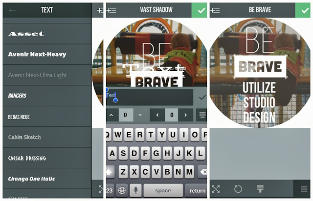
For this tutorial, I've selected the "Be Brave" overlay from the category, "Mantras". Once selected, you can change its color, size, and position.
From here, I decided that I would probably like to crop the photo into a shape. Cropping a photo into a different shape (other than a square or rectangle) can help the photo stand out from other photos. To crop a photo, just go back to your overlay selection and select "crops". There's also the option for "fancy crops" a little further down the list. Once you select your crop shape, you can adjust the color, saturation, and size.
Just so you know, if you want to go back and edit any of the other overlays you've already added, you first have to go back to the sidebar and select the thumbnail of that particular overlay. This takes some getting use to, especially if you're accustomed to using other photo editing tools like PicMonkey.
When you're ready to save your photo, select the green check mark in the top right hand corner of your screen. You will be directed to a preview screen and then you'll have the option to leave a note or description of your design much like Instagram. Then, you can select where you would like to share your design or simply save it to the camera roll on your phone. Finally, your design will be published and will appear on your Studio Design home feed. It's that simple!
Now, let me take a moment to show you what happens when you click the "remix" button under someone's design. Since this is just to show you how it works, I'll remix my own design. The button is a plus (+) sign with an arrow circling around it located just below the design and to the right. Once you click the button, a screen will appear that directs you to take or select a base photo. You also have the option of not using a photo at all. You're not allowed to use the original photo by the designer, which is good because that means others can't use your photos either.
Once you select a new photo, if you choose to use one, the same design will appear on top of your photo. You are free to change any text, sizing, and coloring. You can also delete any overlays that you don't want from that particular design. As you can see below, I've decide to reposition the "Be Brave" overlay and add some text.

Once you're done, you will then repeat the previously mentioned process for saving and sharing your photo.
I don't know that there's a simpler way out there to create visually appealing designs for non-graphic design majors like myself. There's certainly not a more affordable option. Did I mention this awesome app is free? That's probably worth mentioning more than once anyway :-)
I hope that you found this tutorial helpful. At the very least, I hope you download the app and give it a try. If you don't love it; you're not out any money. I genuinely love this app and wanted to share this jewel with all of my fellow bloggers. I hope that you have as much fun as I do when creating designs that will stand out in a sea of photos.
If you'd like to follow me on Studio Design, my username is "aevining". Feel free to "remix" any of my designs! Also, if you have any questions, don't hesitate to ask. I'm still learning but am more than happy to help you any way I can :-)
If you missed my previous post, Beauty Tips and Tricks; I’m sharing it all, feel free to check it out!
Have you linked up to The PINcentive Blog Hop: Week 6 yet? Trust me; you don’t want to miss out! We are choosing 4 winners (instead of 3), one of which will receive sidebar exposure right here on Cropped Stories! This, of course, will be in addition to being featured, co-hosting our next hop and choosing our winner, priority seating, and having their content pinned a minimum of 31 times!
Looking to increase your following? Why not co-host/sponsor my monthly giveaway? Links are only $5.00 for 2 or $10 for 4! Feel free to visit my Co-host a Giveaway page for more details!
Don’t forget to come back on Thursday night/Friday morning for the TGIF Link Party hosted by Living Better Together and I Want Crazy!
Technorati Tags:
studio design,
guest blogger,
guest post,
phone applications,
iphone,
tutorial,
consumer info.,
how-to,
a sweet fragrance,
photo app,
photography,
graphic design


THANK you for sharing - I'm going to check it out. I have a couple of others, but will compare this :) - have a GREAT week
ReplyDeleteWonderful post, thank you for introducing us to Alicia. Thank you for sharing at the Thursday Favorite Things blog hop! ♥
ReplyDeleteDamn. This is why I miss my iPhone. Some of the apps on iPhone aren't avail for Droid. This being one of the MAIN (and ABM) apps I miss the most. I still have my husbands 3gs... LOL
ReplyDeleteVery interesting, I'll send your post to someone I know who might be interested! Thank you!
ReplyDeleteThis is very cool, thanks for sharing. Saying hello from the linkup! stop by designitgirl and say hi!
ReplyDeleteoh my Gosh! This app looks incredible. Can't wait to use it!!!! Thanks A Sweet Fragrance AND Cropped Stories
ReplyDeletehow do i delete my account with studio design
ReplyDelete