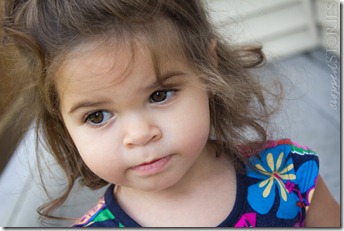
Can you see the differences between the following images? They are pretty subtle so look hard. Give up?
Okay, I’ll tell you.
The dodge and burn tool in Photoshop can be used for so many different things such as brightening/defining eyes, which I published a tutorial on HERE, and other stuff like lightening your highlights and darkening your shadows to add more definition to the face.
For these examples, I used my dodge tool (and in some cases the burn tool) with a large brush at around 342 px (depending on the picture), my range was set to midtones, exposure anywhere from 10 – 16%, and my protect tones button was check marked. Once highlights like upper cheeks, nose, chin, etc. were dodged and shadows like lower cheeks were burned, I then lowered my opacity from 100% to anywhere from 35 – 80%.
In this first example, I dodged her highlights in the picture on the right. Specifically the upper cheeks and nose.
In this second example, I dodged the highlights here as well in the picture on the right. Specifically the upper cheeks, right side of face, chin, and nose.
In this third example, I dodged the highlights and burned the shadows in the picture on the right.
In this last example, I dodged the highlights and burned the shadows as well in the picture on the right. The image on the left looked a little flat to me. Once I brought back definition in the face, it became more dimensional and interesting. Or that’s what I think anyway.
What do you guys think?


great post Elena! I really love that last photo =)
ReplyDelete